Design System
1/20/2025
Ongoing
Atomic Design System — Modern Component Library
A comprehensive, scalable design system built on atomic design principles for modern web applications.
#Design Tokens#Atomic Design#React#Next.js#Tailwind CSS#TypeScript
Visit Live ProjectAtomic Design System — Modern Component Library
A comprehensive, scalable design system built on atomic design principles for modern web applications.
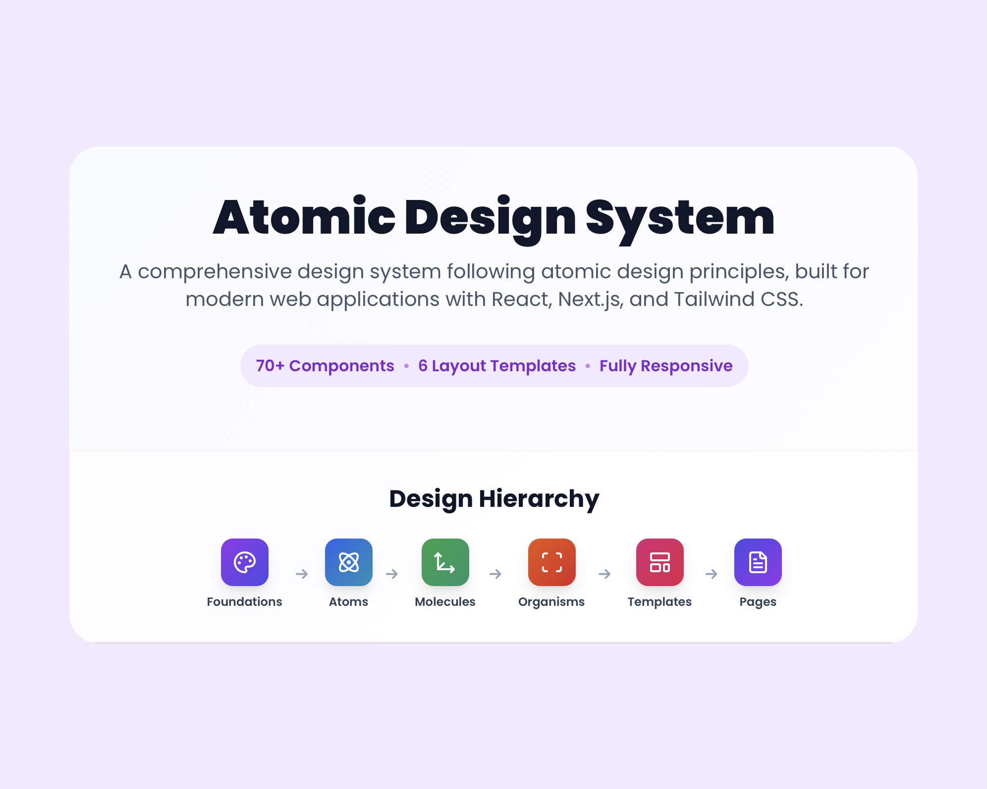
Built a comprehensive design system following atomic design methodology, featuring 70+ components organized across Foundations, Atoms, Molecules, Organisms, Templates, and Pages. The system includes design tokens, typography hierarchy, iconography guidelines, and reusable React components built with Next.js and Tailwind CSS.
🔍
Project Overview
This design system was built to solve the challenge of maintaining consistency across modern web applications. Following atomic design principles, it organizes 70+ components into clear hierarchies from foundational tokens to complete page templates.
Key Features:
• 70+ reusable components across 6 atomic levels
• 3-layer token hierarchy enabling scalable theming
• 100% TypeScript coverage for type safety
• Fully responsive components tested across breakpoints
• Copy-to-clipboard functionality for design tokens speeds up design-to-dev handoff
• Interactive documentation with live component previews
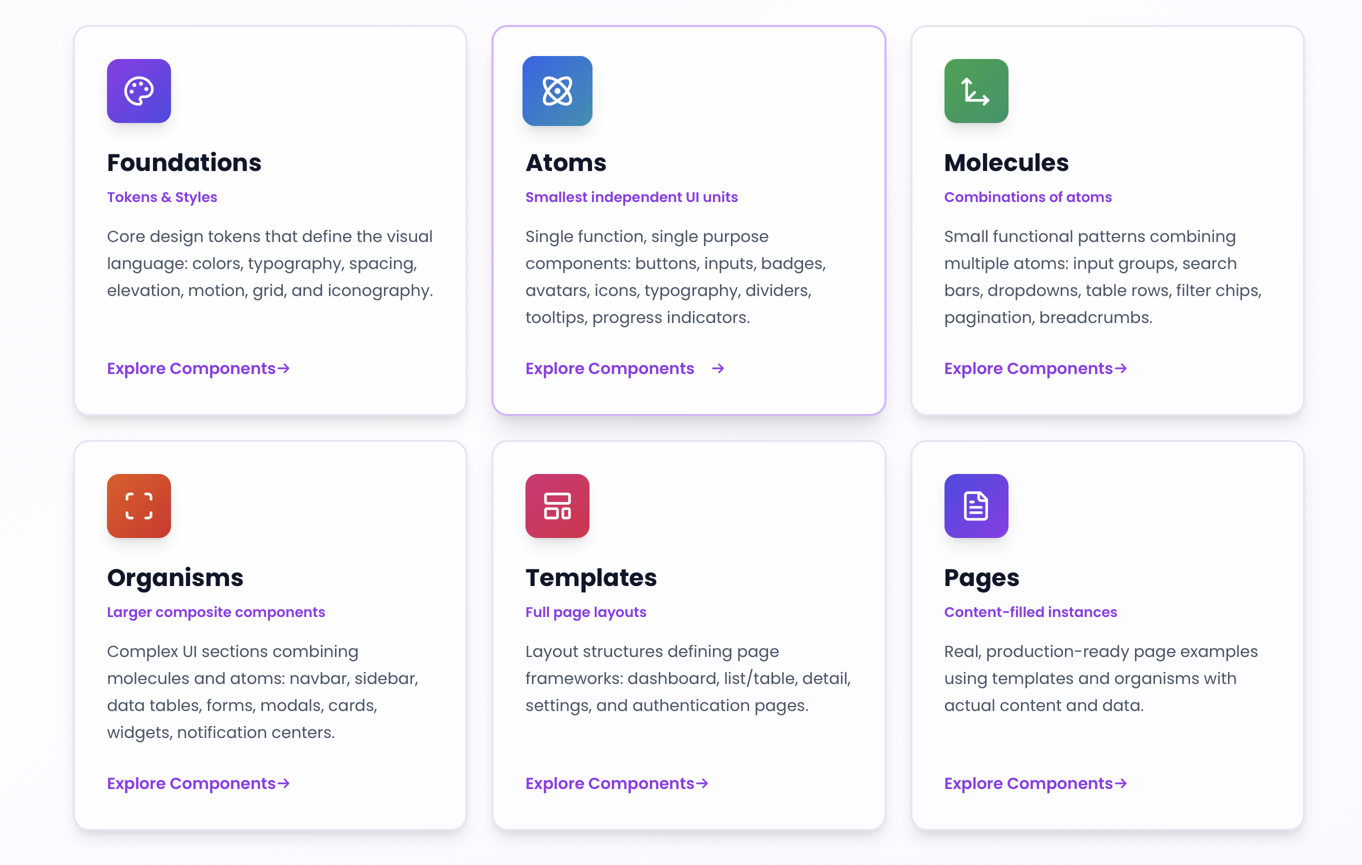
Design System Structure
Organized the system using atomic design principles, creating clear separation between foundational tokens and component implementations.
Atomic Design Levels:
• Foundations: Color, typography, spacing, elevation, motion, grid, and iconography tokens
• Atoms: Buttons, inputs, badges, avatars, icons, typography, and dividers
• Molecules: Input groups, search bars, dropdowns, filter chips, and pagination
• Organisms: Navbar, sidebar, data tables, forms, modals, and widgets
• Templates: Dashboard, list/table, detail, settings, and authentication layouts
• Pages: Complete, content-filled examples using templates
🔍
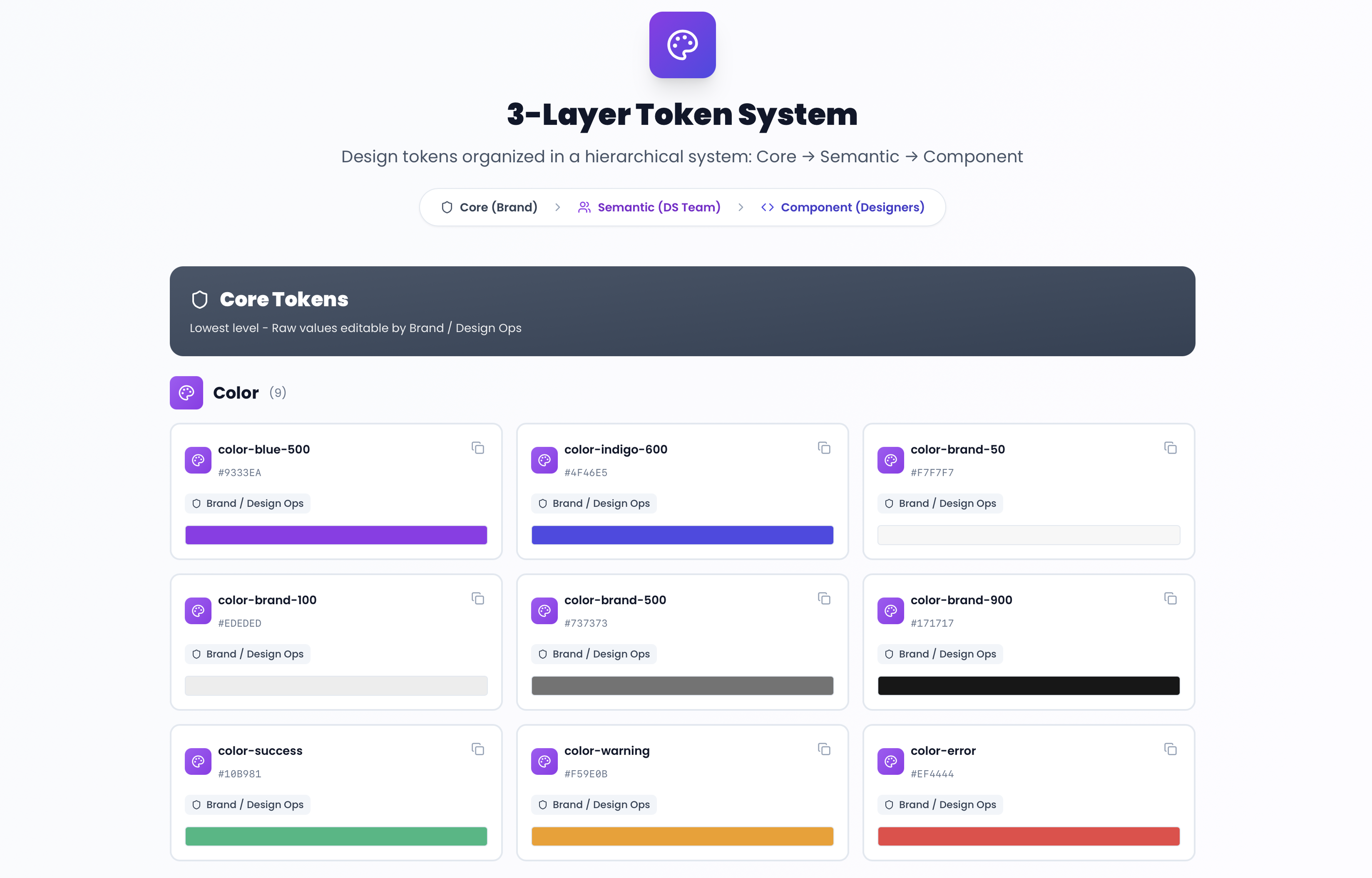
3-Layer Token System
Implemented a comprehensive token system with copy-to-clipboard functionality for seamless design-to-development workflow.
The three-layer token hierarchy:
• Core Tokens: Raw values (colors, typography, spacing) - editable by Brand / Design Ops
• Semantic Tokens: Context-aware tokens (primary, secondary, error, success) - managed by Design System Team
• Component Tokens: Ready-to-use component-level tokens - used by Designers
This structure enables easy updates and theming while ensuring consistency across all components.
🔍
Technology Stack
The design system is built with modern web technologies:
• React & Next.js: Component framework and server-side rendering
• TypeScript: Type safety and developer experience
• Tailwind CSS: Utility-first styling with design tokens
• Lucide React: Icon library integration
• Framer Motion: Smooth animations and transitions
All components are fully responsive and accessible, following WCAG guidelines.
Live Documentation
The design system features interactive documentation where each component can be previewed in real-time. Design tokens can be copied directly from the documentation for use in Figma, making the design-to-development handoff seamless.
Visit the live design system to explore all components, tokens, and guidelines.
Ready to Bring Your Ideas to Life?
Let's collaborate on your next UX project and create exceptional user experiences together.